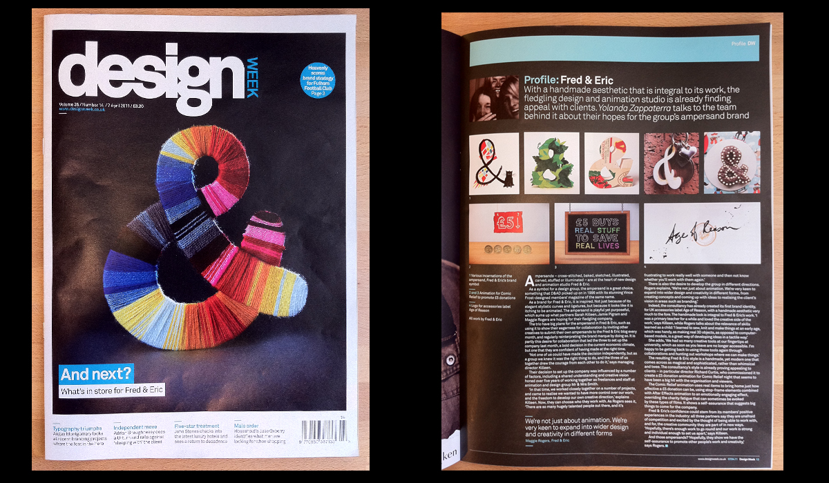
What a Wednesday we’ve had! Fred & Eric made it onto the cover of Design Week with their latest handcrafted ampersand design. See the ampersand taking over news stands for the next week and read our lovely profile by Yolanda Zappaterra. A massive thank you to Design Week! And not forgetting Andrew Meredith who took the beautiful photograph.
www.designweek.co.uk/issues/7-april-2011/profile-fred-eric/

The Article:
Profile: Fred & Eric, 7th April 2011
With a handmade aesthetic that is integral to its work, the fledgling design and animation studio is already finding appeal with clients. Yolanda Zappaterra talks to the team behind it about their hopes for the group’s ampersand brand.
Ampersands – cross-stitched, baked, sketched, illustrated, carved, stuffed or illuminated – are at the heart of new design and animation studio Fred & Eric.
As a symbol for a design group, the ampersand is a great choice, something that D&AD picked up on in 1996 with its stunning Vince Frost-designed members’ magazine of the same name.
As a brand for Fred & Eric, it is inspired. Not just because of its elegant stylistic curves and ligatures, but because it looks like it is itching to be animated. The ampersand is playful yet purposeful, which sums up what partners Sarah Killeen, Jamie Pigram and Maggie Rogers are hoping for their fledgling company.
The trio have big plans for the ampersand in Fred & Eric, such as using it to show their eagerness for collaboration by inviting other creatives to submit their own ampersands to the Fred & Eric blog every month, and regularly reinterpreting the brand marque by doing so. It is partly this desire for collaboration that led the three to set up the company last month, a bold decision in the current economic climate, but one that they are confident of having made at the right time.
’Not one of us could have made the decision independently, but as a group we knew it was the right thing to do, and the three of us together drew the courage from each other to do it,’ says managing director Killeen.
Their decision to set up the company was influenced by a number of factors, including a shared understanding and creative vision honed over five years of working together as freelances and staff at animation and design group Mr & Mrs Smith.
’In that time, we worked closely together on a number of projects, and came to realise we wanted to have more control over our work, and the freedom to develop our own creative direction,’ explains Killeen. Now, they can choose who they work with. As Rogers sees it, ’There are so many hugely talented people out there, and it’s frustrating to work really well with someone and then not know whether you’ll work with them again.’
There is also the desire to develop the group in different directions. Rogers explains, ’We’re not just about animation. We’re very keen to expand into wider design and creativity in different forms, from creating concepts and coming up with ideas to realising the client’s vision in areas such as branding.’
Indeed, the consultancy has already created its first brand identity, for UK accessories label Age of Reason, with a handmade aesthetic very much to the fore. The handmade look is integral to Fred & Eric’s work. ’I was a primary teacher for a while and loved the creative side of the work,’ says Killeen, while Rogers talks about the relevance of skills learned as a child: ’I learned to sew, knit and make things at an early age, which was handy, as making real 3D objects, as opposed to computer-based models, is a great way of developing ideas in a tactile way.’
She adds, ’We had so many creative tools at our fingertips at university, which as soon as you leave are no longer accessible. I’m happy to be getting back to using those tools again through collaborations and hunting out workshops where we can make things.’
The resulting Fred & Eric style is a handmade, yet modern one that comes across as magical and sophisticated, rather than whimsical and twee. The consultancy’s style is already proving appealing to clients – in particular director Richard Curtis, who commissioned it to create a £5 donation animation for Comic Relief night that seems to have been a big hit with the organisation and viewers.
The Comic Relief animation uses real items to bring home just how effective a £5 donation can be, using stop-frame elements combined with After Effects animation to an emotionally engaging effect, overriding the charity fatigue that can sometimes be evoked by these types of films. It shows a self-assurance that suggests big things to come for the company.
Fred & Eric’s confidence could stem from its members’ positive experiences in the industry: all three partners say they are unafraid of competition and excited by the thought of being able to work with, and for, the creative community they are part of in new ways. ’Hopefully, there’s enough work to go round and our work is strong and individual enough to set us apart,’ says Killeen.
And those ampersands? ’Hopefully, they show we have the self-assurance to promote other people’s work and creativity,’ says Rogers.
